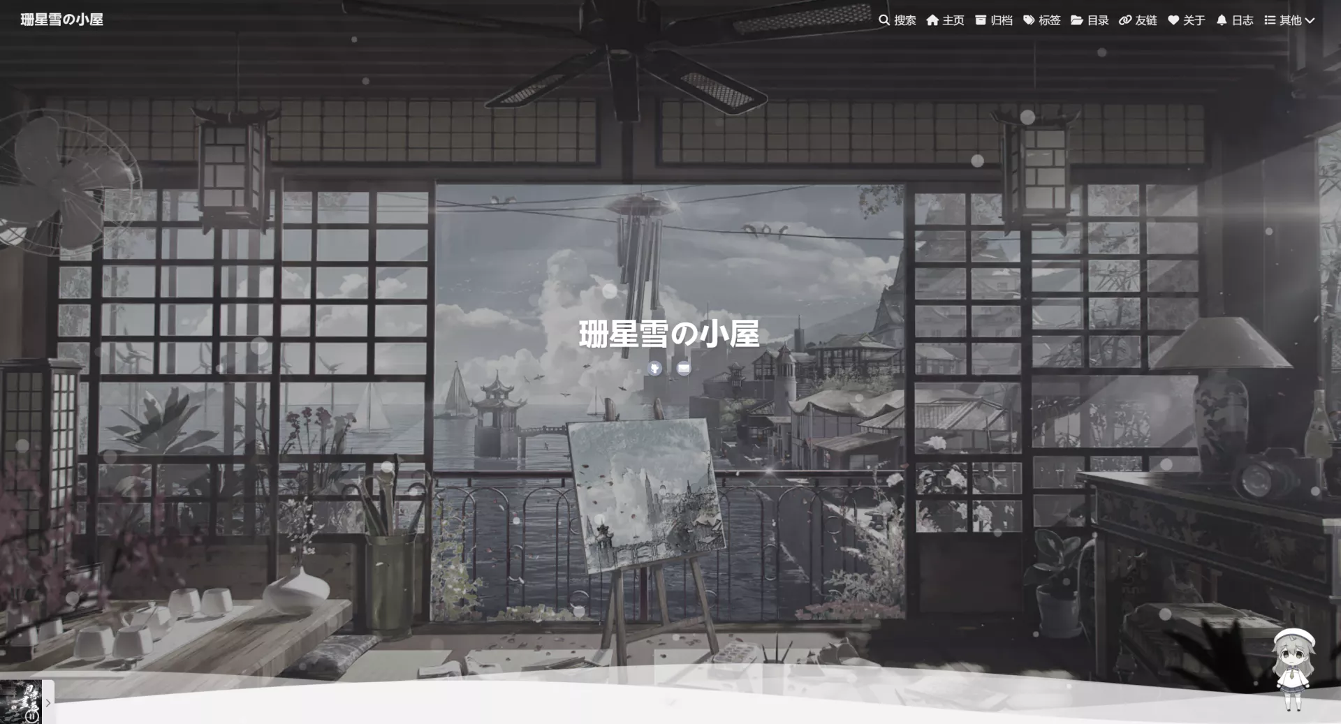
在网上冲浪过程无意中发现这波浪特效,第一眼感觉诶呦真不错,就把它搞过来了233333
参考代码地址
新建wave_style.pug文件
在目录[blog]\themes\butterfly\layout\includes\header\wave_style.pug新建wave_style.pug,并写入如下代码:
1
2
3
4
5
6
7
8
9
| section.main-hero-waves-area.waves-area
svg.waves-svg(xmlns='http://www.w3.org/2000/svg', xlink='http://www.w3.org/1999/xlink', viewBox='0 24 150 28', preserveAspectRatio='none', shape-rendering='auto')
defs
path#gentle-wave(d='M -160 44 c 30 0 58 -18 88 -18 s 58 18 88 18 s 58 -18 88 -18 s 58 18 88 18 v 44 h -352 Z')
g.parallax
use(href='#gentle-wave', x='48', y='0')
use(href='#gentle-wave', x='48', y='3')
use(href='#gentle-wave', x='48', y='5')
use(href='#gentle-wave', x='48', y='7')
|
引入css样式
在自定义引入的custom.css文件(不懂该文件看魔改配置部分)添加如下代码:
1
2
3
4
5
6
7
8
9
10
11
12
13
14
15
16
17
18
19
20
21
22
23
24
25
26
27
28
29
30
31
32
33
34
35
36
37
38
39
40
41
42
43
44
45
46
47
48
49
50
51
52
53
54
55
56
57
58
59
60
61
62
63
64
65
66
67
68
69
70
|
.main-hero-waves-area {
width: 100%;
position: absolute;
left: 0;
z-index: 0;
bottom: -7.5px
}
.waves-area .waves-svg {
width: 100%;
height: 5rem
}
.waves-area .parallax>use {
-webkit-animation: move-forever 25s cubic-bezier(.55, .5, .45, .5) infinite;
animation: move-forever 25s cubic-bezier(.55, .5, .45, .5) infinite
}
.waves-area .parallax>use:first-child {
-webkit-animation-delay: -2s;
animation-delay: -2s;
-webkit-animation-duration: 7s;
animation-duration: 7s;
fill: #ffffffb3
}
.waves-area .parallax>use:nth-child(2) {
-webkit-animation-delay: -3s;
animation-delay: -3s;
-webkit-animation-duration: 10s;
animation-duration: 10s;
fill: #ffffff80
}
.waves-area .parallax>use:nth-child(3) {
-webkit-animation-delay: -4s;
animation-delay: -4s;
-webkit-animation-duration: 13s;
animation-duration: 13s;
fill: #ffffff4d
}
.waves-area .parallax>use:nth-child(4) {
-webkit-animation-delay: -5s;
animation-delay: -5s;
-webkit-animation-duration: 20s;
animation-duration: 20s;
fill: #f9fafb
}
@-webkit-keyframes move-forever {
0% {
transform: translate3d(-90px, 0, 0)
}
to {
transform: translate3d(85px, 0, 0)
}
}
@keyframes move-forever {
0% {
transform: translate3d(-90px, 0, 0)
}
to {
transform: translate3d(85px, 0, 0)
}
}
|
- 防止开屏浮动箭头和社交图标被wave特效遮挡:
custom.css文件继续添加代码:
1
2
3
4
5
6
7
|
#page-header #scroll-down .scroll-down-effects{
z-index: 10;
}
#page-header #site_social_icons{
display: flow-root;
}
|
添加引入位置
在[blog]\themes\butterfly\layout\includes\header\index.pug文件中如下位置添加代码:
1
2
3
4
5
6
7
8
9
10
11
12
13
14
15
16
17
18
19
20
21
22
| header#page-header(class=isHomeClass style=bg_img)
!=partial('includes/header/nav', {}, {cache: true})
if top_img !== false
if is_post()
include ./post-info.pug
else if is_home()
#site-info
h1#site-title=site_title
if theme.subtitle.enable
- var loadSubJs = true
#site-subtitle
span#subtitle
if(theme.social)
#site_social_icons
!=fragment_cache('social', function(){return partial('includes/header/social')})
#scroll-down
i.fas.fa-angle-down.scroll-down-effects
else
#page-site-info
h1#site-title=site_title
!=partial('includes/header/wave_style', {}, {cache: true})
|
黑暗模式适配
在自定义引入的custom.css文件继续添加如下代码:
1
2
3
4
5
6
7
8
9
10
11
12
13
14
15
16
| [data-theme=dark]
.waves-area .parallax>use:first-child {
fill: #0f172ab3
}
[data-theme=dark]
.waves-area .parallax>use:nth-child(2) {
fill: #0f172a80
}
[data-theme=dark]
.waves-area .parallax>use:nth-child(3) {
fill: #0f172a4d
}
[data-theme=dark]
.waves-area .parallax>use:nth-child(4) {
fill: #070b14
}
|
背景色适配
本站采用了自定义背景色,背景色不是纯白用纯白的话感觉差那么一点点,虽然都好看WoW
- 修改
custom.css背景色和波浪特效颜色代码:
1
2
3
4
5
6
7
8
9
10
11
12
13
14
15
16
17
18
19
20
21
22
23
24
25
26
27
28
29
30
31
32
33
34
35
36
37
38
39
40
41
42
43
44
45
46
47
48
49
50
|
#web_bg {
background: rgba(246, 239, 246);
}
[data-theme=dark]
#web_bg {
background: rgb(4, 4, 4);
}
#content-inner {
background-color: #F6EFF6;
}
[data-theme=dark] #content-inner {
background-color: #020305
}
.waves-area .parallax>use:first-child {
-webkit-animation-delay: -2s;
animation-delay: -2s;
-webkit-animation-duration: 7s;
animation-duration: 7s;
fill: #F6EFF6b3
}
.waves-area .parallax>use:nth-child(2) {
-webkit-animation-delay: -3s;
animation-delay: -3s;
-webkit-animation-duration: 10s;
animation-duration: 10s;
fill: #F6EFF680
}
.waves-area .parallax>use:nth-child(3) {
-webkit-animation-delay: -4s;
animation-delay: -4s;
-webkit-animation-duration: 13s;
animation-duration: 13s;
fill: #F6EFF64d
}
.waves-area .parallax>use:nth-child(4) {
-webkit-animation-delay: -5s;
animation-delay: -5s;
-webkit-animation-duration: 20s;
animation-duration: 20s;
fill: #F6EFF6
}
|
收工
隶属于文章hexo 博客 butterfly 主题安装及魔改笔记
 wechat